Re: New website!
Posted: Tue Oct 15, 2019 11:33 am
This is an amazing update. 

Vaguely reminiscent of the SMF forums too. Especially if you turn off 100% widthJousi wrote: Wed Oct 16, 2019 2:19 pm The new modern look is very good. It indeed maintains the core visuals of the site while looking fresh.
Great work!

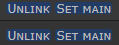
I'm not sure what you mean. They behave exactly like all other buttons. The only differences are that they are smaller (less margin around the text) and that the text color isn't as bright. It may look like just text with a blue background but it is actually the same as all other buttons, just smaller (which makes it harder to see that).Tezey wrote: Thu Oct 17, 2019 1:11 pm These "buttons" look like they are selected when they're really just buttons, perhaps make them acctuall buttons and not just a blue background?
Yes it is. It was just making people pass up on the server before even trying it.Patel wrote: Sun Oct 20, 2019 7:38 pm Not sure if I'm just blind, but is the list of online players gone?
@Rapsey
Would you agree they look like highlighted text though? Idk, something feels off about themRapsey wrote: Mon Oct 21, 2019 12:50 pm I'm not sure what you mean. They behave exactly like all other buttons. The only differences are that they are smaller (less margin around the text) and that the text color isn't as bright. It may look like just text with a blue background but it is actually the same as all other buttons, just smaller (which makes it harder to see that).
It's 100% visual and just deceives the eye because the actual button is almost as big as the distance between the "capital-height" and "tail-height". If there was more whitespace (or, bluespace in this case) around the top and bottom of the letters, it'd be resolved. A small change of 1-2px might even suffice. E: all 'bluespace' will need to increase, especially padding-right could use some I assume since the K ends and a pixel or so later the button ends.Tezey wrote: Mon Oct 21, 2019 10:45 pmWould you agree they look like highlighted text though? Idk, something feels off about themRapsey wrote: Mon Oct 21, 2019 12:50 pm I'm not sure what you mean. They behave exactly like all other buttons. The only differences are that they are smaller (less margin around the text) and that the text color isn't as bright. It may look like just text with a blue background but it is actually the same as all other buttons, just smaller (which makes it harder to see that).